Securing Canvas Quizzes with IP Filtering & Access Codes
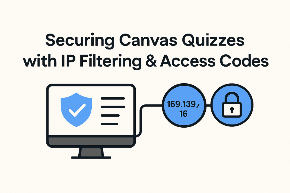
As educators, we continually work to prevent cheating on exams. Even with in-class quizzes, students often try to access the test from home and turn a closed‑notes exam into an open‑notes one. This guide will show you how to secure your Canvas quizzes so they can only be taken at school. I am writing this … Read more